
Our Journey from Project to Program
Appian Around the World is a series of one-day complimentary events tailored for Appian's customers and invited guests.
I was fortunate enough to share my organization's success story at Appian Around The World 2016 (Midwest).
Theme of the session was:
How Appian has helped us grow and what we have done so far to manage all the complexity that comes with such growth
To learn more about Appian, visit their website.
Disclaimer: Opinions expressed are solely my own and do not express the views or opinions of my employer.

UX Patterns For Enterprise Applications – Tabular Data
In absence of a well-defined system, a spreadsheet is perhaps one of the most common tools that workers utilize for getting work done. Just because a system is replacing spreadsheets does not mean the flexibility that spreadsheets provide should be taken away too. Instead, systems should, of course, provide a reason for workers to make the switch.

The following patterns are all relevant to dealing with tables.
- Screens should provide users the ability to directly manipulate data in tables, just like they are used to in a spreadsheet software.
- Provide users with context-sensitive menus e.g. in the screenshot above users have the option to delete the row simply by clicking a button instead of first selecting some check box and then clicking on a button elsewhere around the table.
- If data in a table is being inputted on a different screen or in a modal dialog then there should be some type of indication on the table that shows if data for a particular row has been completely entered or not (Completed, Pending). This helps users know how much work has been completed and how much is still pending.
Want to learn more about UX Patterns? Download your copy of "UX Patterns for Enterprise Applications" here.

UX Patterns For Enterprise Applications – Smart Defaults
One of the common issues that manual processing causes are data errors. So, while automating processes wherever human input is required, try keeping the data entry to a minimum. In order to do so use following approaches.
Pre-populate Data
Load as much data by default as possible e.g. a user’s information from LDAP

Provide Options
Provide a list of values instead of a free form input e.g. type of issue. This reduces any erroneous data entries and is useful when doing analytics.

Pre-Calculate
Make the interface do as many calculations as possible e.g. in the screenshot above the interface is calculating total in $ and then total cost to the client in ¥.

Want to learn more about UX Patterns? Download your copy of "UX Patterns for Enterprise Applications" here.

How BPM Cycle Has Evolved
Emiel Kelly in his post "Customers don’t care about BPM cycles" provides insights into how the age old BPM cycle has evolved over the years. Almost everyone in the BPM industry is familiar with the following cycle, this is usually the first thing we learn and then teach.

Source: Emiel Kelly
Following cycle shows the more mature and evolved cycle of BPM. Interesting points to note:
- Having both Design and Model steps in the cycle has always been confusing, so this definitely removes that confusion.
- Execute step is more defined now and gives an idea about what really happens.
- Removing Optimize makes sense because that is the whole goal of the cycle and is not just an activity.
- Of course adding the swim lanes clarifies who does what.

Source: Emiel Kelly

UX Patterns For Enterprise Applications – Input Fields
How you design input fields will also directly correlate to the number of user interactions (eyes, mouse/keyboard/touch). If you have an input intensive form, then users might end up spending a lot of time filling out data.
For example, take a look at the figure below, there are only 3 data elements but it requires at least 7 different user interactions.

Now the next figure captures exactly the same number of data elements, but significantly reduces the number of user interactions. Just by unifying all the fields, and making the system do a bit more work such as auto-formatting, user’s efficiency has been increased and the number of interactions reduced.

Another point to note here is the use of labels. In first figure, all labels are adjacent to the input field, while in the second figure they are above the input fields. Research has also shown that placing the labels above input fields makes it clearer for users, and is easier on the eyes.
Want to learn more about UX Patterns? Download your copy of "UX Patterns for Enterprise Applications" here.

UX Patterns For Enterprise Applications – Urgency & Timeliness
Due Dates are important to ensure cycle times are met, but how and where they are displayed make a difference. Taking cue from our daily conversations, “Due in 1 Day” seems more hu-man as compared to “Due On Tuesday 12:45:15 PM GMT”.

So displaying Due In versus the Due On will present the information in a friendly manner, yet show the urgency of the task.
Want to learn more about UX Patterns? Download your copy of "UX Patterns for Enterprise Applications" here.

Why Digital Transformation Can't Proceed Without Operational Process Transformation
MWD Advisors’ Neil Ward-Dutton reently did a webinar explaining how digital transformation can't proceed without process digitization.
As usual, he is absolutely correct! Organizations going through digital transformation journey focus more on transforming customer experience and business model. Both of these areas are visible to the customer hence considered more important than operational processes.
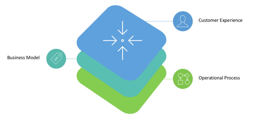
A great looking website, mobile app or a digital product is required, they will (likely) result in great customer conversion rates, but in all cases, they will trigger or interact with some internal process. An organization will be able to acquire new customers of course, but customer retention will heavily depend on how good or bad their internal processes are.
Internal processes should not be visible to the customer. A bad internal process will be visible to the customer, it will not only annoy the customer but frustrate workers as well. A good process, on the other hand, will be invisible, which should be the goal. The customer experience should be so seamless that a customer should not need to know an organization's internal processes.
There are three building blocks of operational process transformation:
- Process Digitization
- Worker Engagement
- Performance Management
Organizations can focus on each of these building blocks to transform their operational processes, which in turn advances them in their digital transformation journey.
Read more about operational process transformation.

UX Patterns For Enterprise Applications – Milestones
Workflows are a core piece of enterprise apps, and most work follows a process either structured or unstructured. The process is implemented either by code or some visual drag and drop tool. In both cases, a user of the application cannot understand the implementation details of the process (nor they should), so they cannot easily tell where are they in the process.
A very simple and effective way is to wrap all that complexity in progress bar that provides milestone level information upfront on the screen. For longer processes, these can be high-level milestones that are relevant to users and for smaller processes, major activities can be included. Following two figures show how a milestone progress bar might look.
![]()
If more milestone information is required to be displayed to the users then following design can be used.

Whichever design you choose, the idea is to clearly show all the milestones that a user needs to complete, and where they are right now in the process.
Want to learn more about UX Patterns? Download your copy of "UX Patterns for Enterprise Applications" here.

UX Patterns For Enterprise Applications – Layout
How information is laid out on the page will have a direct impact on time a user needs to locate something. Clearly marking and grouping related information will reduce the time a user wastes looking for information.
Based on different factors such as how much information needs to be displayed or how the information will be used, different types of designs can be used.
Single Column
Use single column layout for the screen, and keep borders clean. This will make the flow of information easier for users.
Long Form
If there is a lot of information and displaying that in one long form will be problematic, then information can be divided into tabs.

Short Form
For shorter screens, simply use sections. Sections that are informative only should be collapsed by default so that users can focus on information that requires their attention.

Data Comparison
In both the cases i.e. tabs and sections, users will need to navigate between tabs and sections to find information. These design work well in most scenarios except when users need to compare information from different sections. A great option in such scenario is the card layout design. Card layout design allows users to expand/collapse cards, move them around so that only required information is on the screen in a location that helps the user perform a comparison.

Kanban Board
Kanban Board is a great pattern which is widely used in most Agile project tracking tools. This pattern as shown in the figure below provides three types of information in one glance.
- What are all the tasks
- What is the status of each task?
- Detailed information for each task (when selected)

A great benefit of all these designs is faster load times. Since information is grouped into tabs, sections or cards, it is not required to be loaded all at once. You can use the concept of lazy loading to greatly improve screen performance i.e. only load data when the user opens a section, tab or card.
Highlight Sections
Regardless of the layout you choose, you can further reduce the time required locating information by using highlighting sections. The idea is to either use a different color or some other notation to identify sections that need attention or input. That way, users can directly go to the sections that need attention, instead of going through each section trying to figure out the same.
Conditional Visibility
Users of enterprise apps are bombarded with a lot of information, one way to make sure that they do not see irrelevant fields is to use the concept of conditional visibility.
The idea of conditional visibility is simple, input fields that are dependent on other inputs should not be displayed at the time of form load. Loading all the fields can be a bit overwhelming and confusing. Dependent fields should only show up when their dependencies have been met. For example, in the screenshot below, the second question should only be asked if the answer to the first question is Yes, otherwise it is one additional field that takes time.

Another tip to remember is to use transitions instead of showing changes instantly. Users might not even get a chance to notice if a new field has appeared if it suddenly shows up. So, the dependent field should show up at the speed that user can actually see it got appearing on the form.
Want to learn more about UX Patterns? Download your copy of "UX Patterns for Enterprise Applications" here.

UX Patterns For Enterprise Applications – Inbox
Work inbox is the hub of entire application; this is one central location where each user comes to get work and plan their day. This post discusses patterns to consider while designing a work inbox.
Here is a list of three frequently used methods for the work assignment.
- Tasks assigned to an individual
- all tasks are visible in the work inbox and the person gets to pick which task they work on first
- based on priority and skills of the individual system only assigns a single task to an individual
- Tasks assigned to a team

Folder & Tags
Outlook and most other email programs provide a great way to sort and categorize work. In a similar manner users should have the ability to define their own rules to categorize work. Custom folders and tags are a great example of this capability.

Search Filters
Search filters provide users the ability to sift through a lot of tasks that might need their attention. Option to narrow results by a date range, process, application, tags, priority, and status are most commonly used filters.

In-Line Decisions
For users that are mostly responsible for review and approvals a great way to expedite their work and reduce the number of clicks is to give them in-line decision option.
These inline decisions can be Approve and Reject buttons available in the Work Inbox, as a link in email or a message on an IM. This way they do not even need to login to the system, but their existing email box becomes their work inbox.

Prioritization / Due Date
Users should be able to identify quickly what work needs their immediate attention. This could be because of work’s priority or because it is at risk / overdue. Following methods can be used to show priority and urgency.
- Highlighting Tasks
- Blinking Due Date
- Adding a Flag

Want to learn more about UX Patterns? Download your copy of "UX Patterns for Enterprise Applications" here.